Shared element transitions are one of those things that everyone loves when they see them, but very few people actually enjoy implementing them. When they work, the app suddenly feels premium. When they don’t, you’re staring at your screen wondering why a simple animation turned into a full debugging session.
In modern Android apps, navigation is more than moving from screen A to screen B. It’s about continuity. Shared element transitions help users keep context, this thing you tapped is the same thing you’re now looking at, just in more detail. When done right, they remove friction and make the UI feel calm and intentional.
In this article, I’ll walk through how to implement shared element transitions using Jetpack Navigation and Compose, without third party libraries, and more importantly, how to make them behave in a real app.
Why Shared Element Transitions Matter
This isn’t about fancy animations. It’s about reducing cognitive load.
When users tap an item in a list and that same element visually transforms into the detail screen, the UI explains itself. There’s no mental jump, no moment of “wait, where am I now?”. Especially in feeds, catalogs and content heavy apps, this kind of continuity makes a huge difference.
It also helps with perceived performance. Even if nothing actually gets faster, smooth transitions make the app feel faster, and that’s often what users care about.
Project Setup
To follow along, you’ll need access to the experimental shared transition APIs in Compose. The project uses a very standard setup, nothing exotic here.
Key dependencies from libs.versions.toml and build.gradle.kts:
- Compose Animation, for
SharedTransitionScopeandModifier.sharedElement() - Navigation Compose, to handle destination changes and animation scopes
- Kotlinx Serialization, for type safe navigation routes
dependencies {
    implementation(libs.androidx.navigation.compose)
    implementation(libs.kotlinx.serialization.json)
    implementation(platform(libs.androidx.compose.bom))
}
If you’re already using the Compose BOM, you usually don’t need to worry about animation versions explicitly.
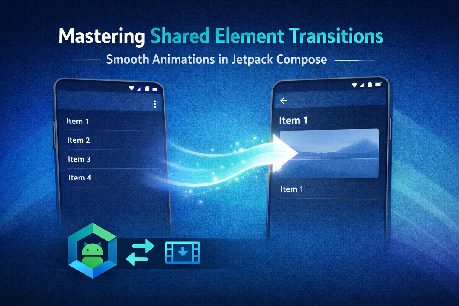
A Simple Use Case, List to Detail
I’m using a very classic scenario for the demo, a list of items that navigates to a detail screen. Each item has an image and a title, and both participate in the transition.
It’s simple on purpose. This pattern already covers most of the problems you’ll face in real projects, stable keys, recomposition, navigation arguments and back navigation.
Detailed Implementation Guide
At a high level, shared element transitions in Compose depend on three things, a common parent scope, an animation visibility scope and stable keys. Miss one of these and things start to break in very confusing ways.
1. Defining the SharedTransitionScope
All shared element transitions need a common parent that can coordinate measurements and motion. In this case, that parent is SharedTransitionScope, which wraps the entire NavHost.
SharedTransitionScope {
    NavHost(
        modifier = it,
        navController = controller,
        startDestination = Routes.List
    ) {
        // destinations
    }
}
Placing it here keeps the setup simple and avoids spreading animation related concerns across your UI.
2. Passing the AnimatedVisibilityScope
This is where a lot of implementations go wrong.
Modifier.sharedElement() needs an AnimatedVisibilityScope to know when a transition is happening. Navigation provides this scope inside each composable destination, but it’s your responsibility to pass it down to the screen.
If you forget this step, the code compiles, nothing crashes, and the transition just… doesn’t happen.
3. Applying Modifier.sharedElement
On both the list and detail screens, the shared elements must use the exact same key. No shortcuts here.
Image(
    modifier = Modifier
        .sharedElement(
            sharedContentState = rememberSharedContentState("item_${item.drawableRes}"),
            animatedVisibilityScope = animatedVisibilityScope
        )
        .size(50.dp),
    painter = painterResource(item.drawableRes),
    contentDescription = item.text
)
And on the destination screen:
Image(
    modifier = Modifier
        .sharedElement(
            sharedContentState = rememberSharedContentState("item_${item.drawableRes}"),
            animatedVisibilityScope = animatedVisibilityScope
        )
        .size(200.dp),
    painter = painterResource(item.drawableRes),
    contentDescription = item.text
)
If the keys don’t match perfectly, Compose will simply treat these as two unrelated elements and skip the transition.
Handling Navigation
Navigation itself is fairly straightforward. I’m using type safe routes and passing the item data directly when navigating to the detail screen.
onClick = {
    controller.navigate(
        Routes.Details(
            drawableRes = it.drawableRes,
            text = it.text
        )
    )
}
The transition works because both destinations live inside the same SharedTransitionScope and receive compatible AnimatedVisibilityScope instances. Behind the scenes, Compose uses the Lookahead phase to calculate the target layout before the animation starts, which is what allows elements to smoothly resize and move.
Handling State and Recomposition
If shared element transitions feel flaky, state is usually the reason.
Recomposition can recreate composables at times you don’t expect. If your shared element key changes, even briefly, the transition system loses track of the element.
Use stable identifiers from your data model, avoid list indices and be careful with derived state. In my experience, when a transition works once and then randomly stops working, this is almost always the cause.
Common Pitfalls and Gotchas
A few things that tend to bite people:
- Using list indices as shared element keys
- Triggering navigation before the UI has fully settled
- Forgetting to restore the same keys on back navigation
- Parent layouts clipping content during the transition
Always test both forward and backward navigation. Many issues only show up when going back.
Accompanist vs Jetpack Navigation
For a long time, Accompanist was the only real option for shared element transitions in Compose. It’s still powerful, but for most apps today, Jetpack Navigation is the simpler and more future proof choice.
Fewer dependencies, better integration and less long term maintenance.
—
The Demo Project
I’ve put together a small GitHub project that focuses only on shared element transitions with Jetpack Navigation and Compose. No extra abstractions, no clever tricks, just the essentials.
The README explains how to run it and includes a GIF showing the final result.
When Not to Use Shared Element Transitions
As nice as they are, shared element transitions aren’t free.
They add complexity, can hurt performance on low end devices and may cause issues with accessibility if overused. If an animation doesn’t clearly improve understanding or flow, it’s usually better to skip it.
Final Thoughts
Shared element transitions sit right at the intersection of UX and architecture. When they’re done well, users notice. When they’re done badly, developers notice.
Jetpack Navigation and Compose finally give us the tools to implement them cleanly. Start simple, use stable keys and treat animations as a core part of your UI, not just decoration.
The KMP Bits App
If you want an easier way to read articles like this, I just released the KMP Bits mobile app, built entirely with Kotlin Multiplatform. It makes reading and navigating content much faster.
You can follow along and stay updated directly in the app:
➡️ App Store | ➡️ Google Play
If you enjoyed this article:
- Follow KMP Bits for more Kotlin and KMP content.
- Check out the app for a better reading experience.
- Share this article if you think others might benefit from it.
Thanks for reading, and see you on the next lap.
Comments
Loading comments...